Pro Metrics Overview (Pro)
The DefectDojo Pro UI has various Metrics dashboards to help visualize your current security posture. Each dashboard allows stakeholders at different levels of the organization to make informed decisions without needing to interpret raw data or navigate individual Findings. These dashboards include:
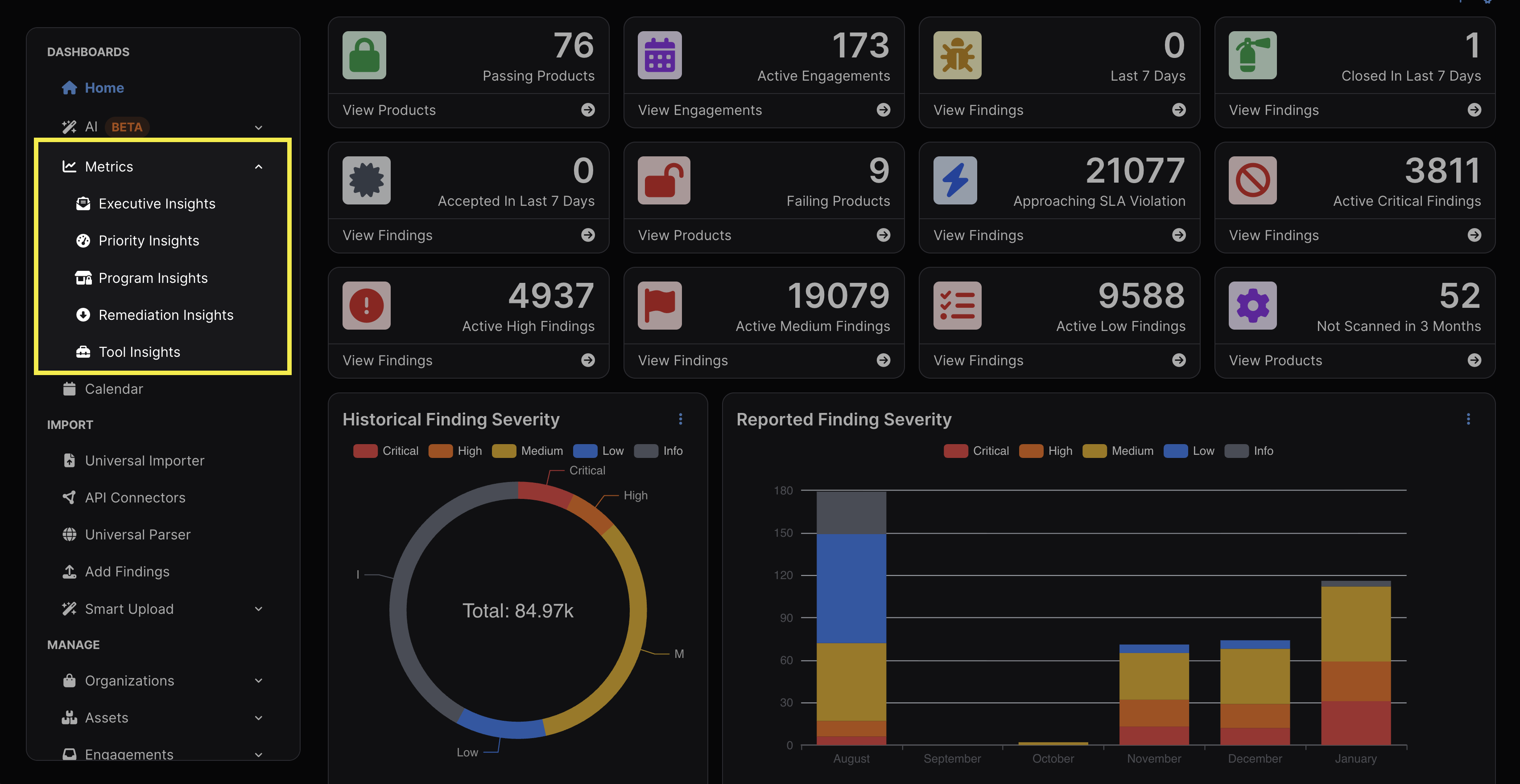
Metrics Features
Before elaborating on each particular dashboard, there are some commonalities between all dashboards that are worth reviewing.
Filtering
All Metrics can be filtered by timeframe, Organization, Asset, and Tag. After adjusting the filter as desired, Apply Filter must be clicked in order for the filter to take effect. If you wish to export a PDF of all charts, tables, and graphs on the dashboard as currently filtered, click Export as PDF.
The filtering timeframe is limited to the past year, but can otherwise be adjusted to include the past 7, 14, 30, 90, or 180 days.
Note that filter parameters are rendered in the URL, so you can bookmark multiple pages with various filter parameters. This can be useful for quick reference, or for consistently generating a particular kind of report.
Submenus
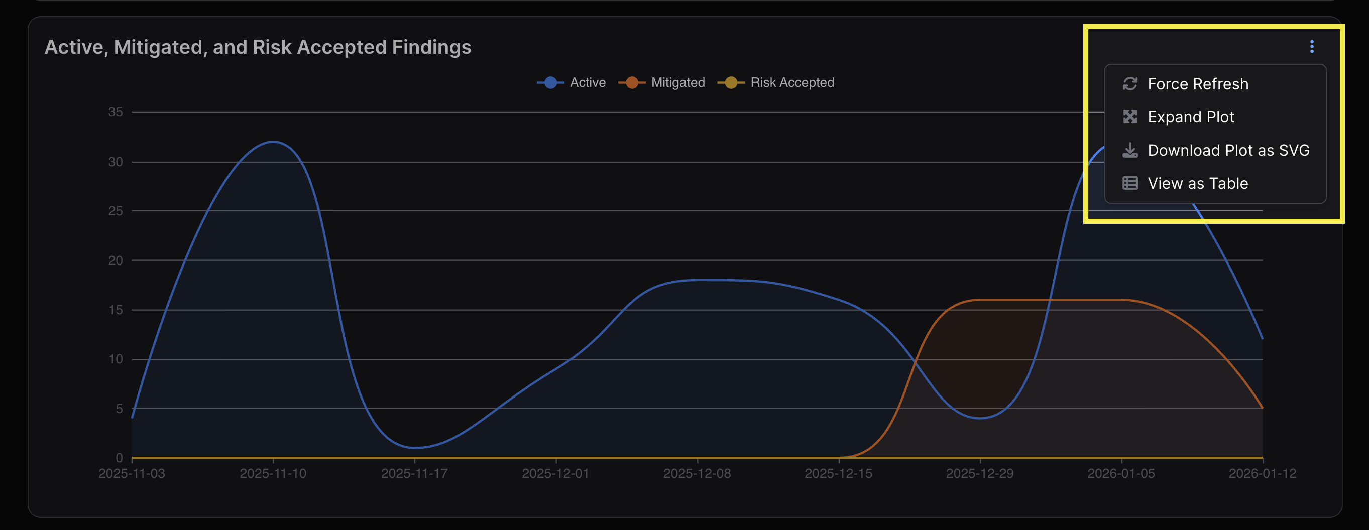
Each graph has a ⋮ kebab menu in the top right of each view with the following features:
- Force Refresh — Manually refreshes to incorporate any new updates in the data.
- Expand Plot — Opens the same chart in a larger pop-up modal.
- Download Plot as SVG — Downloads the chart as an SVG file.
- View as Table — Shows the data from the chart in table format.
- Each column of the table can be toggled to appear in ascending or descending order when clicked. You can also download each table.
Access
The Metrics section will only represent data from the Organizations and Assets that each User has the appropriate permissions to view. A User with access limited to a single Asset will only be able to see Metrics for that particular Asset, but if they don’t have access to the other Assets within the parent Organization, data from those other Assets won’t be represented in Metrics.
Viewing Data Within Charts
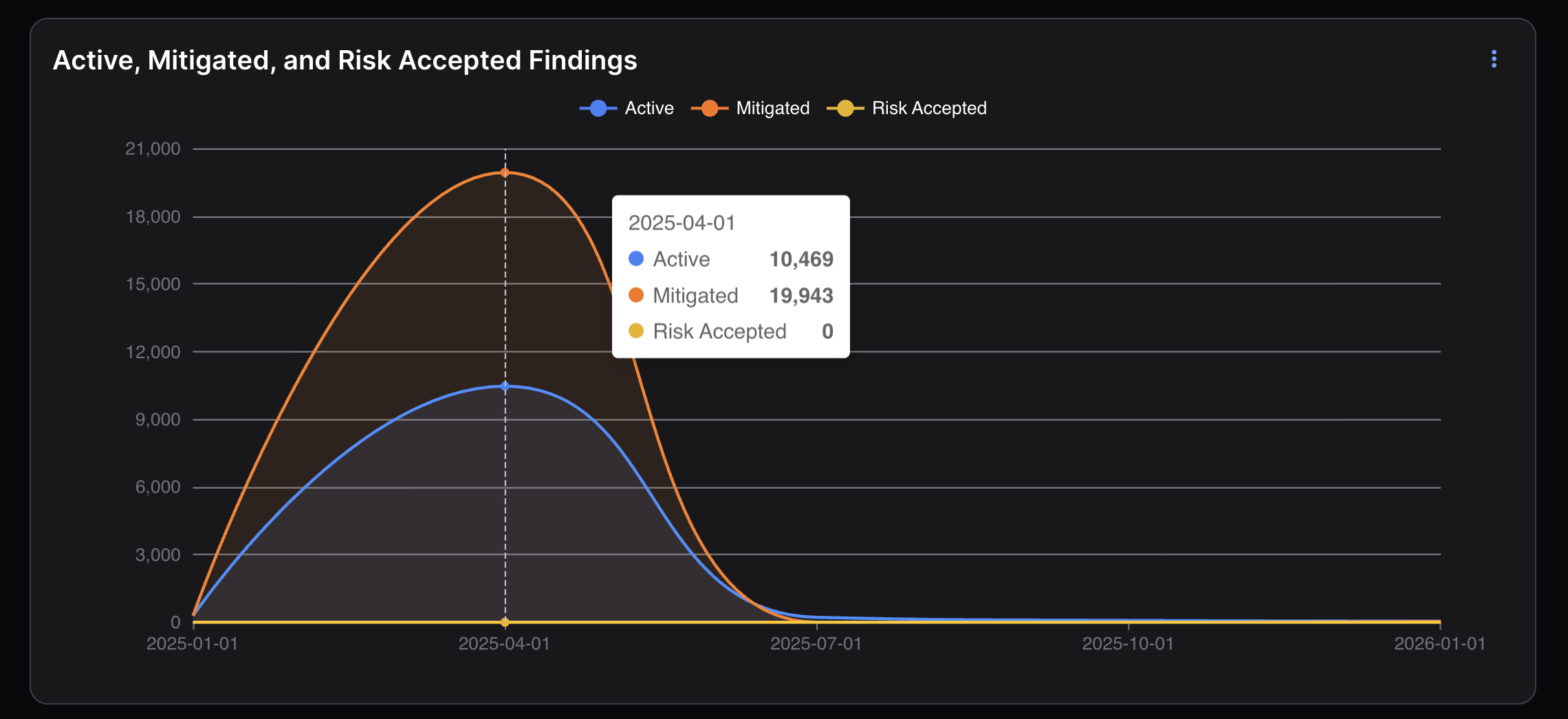
The X-axis of line charts will always represent the current timeframe filter. Hovering your cursor over a line chart will cause a modal to appear with a count of the figures on the Y-axis at that point in time.
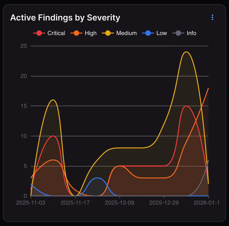
Toggling Results
Users can toggle certain categories of Findings as viewable and nonviewable in the chart by clicking on their respective color/name at the top of each chart.
For example, in the Active Findings by Severity chart below, if you only wanted to see Findings with a High or Critical severity, you would click Medium, Low, and Info at the top to remove those results from the chart. Clicking Medium, Low, and Info again would make those results reappear.