

🎨 Pro UI Changes (Pro)
In late 2023, DefectDojo, Inc. released a new UI for DefectDojo Pro, which is now the default UI for this edition.
The Pro UI brings the following enhancements to DefectDojo:
- Modern and sleek design using Vue.js.
- Optimized data delivery and load times, especially for large datasets.
- Access to new Pro features, including Upstream Connectors, Universal Importer, and Pro Metrics views.
- Improved UI workflows: better filtering, dashboards, and navigation.
Switching To The Pro UI
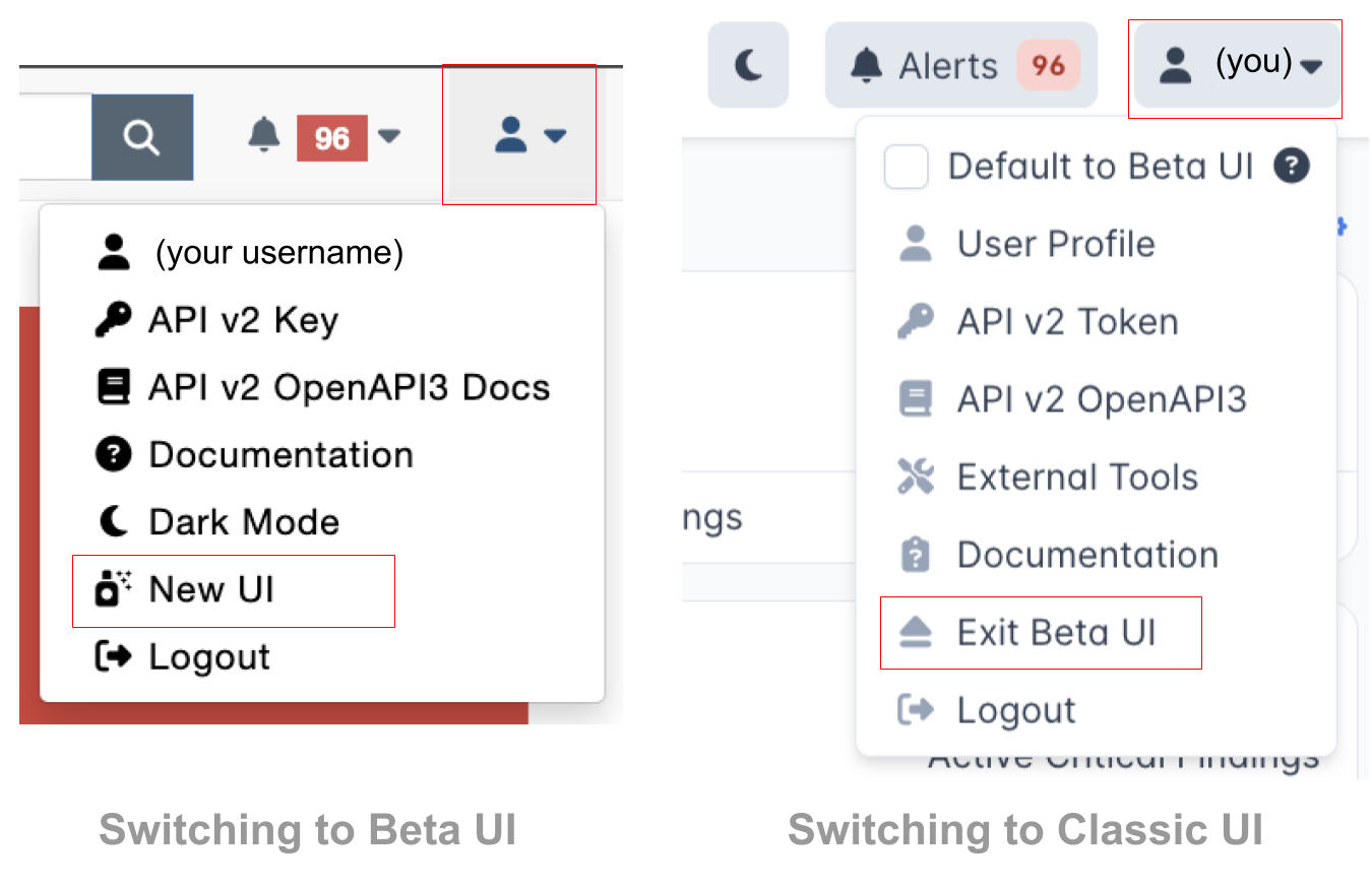
To access the Pro UI, open your User Options menu from the top-right hand corner. You can also switch back to the Classic UI from the same menu.
Navigational Changes
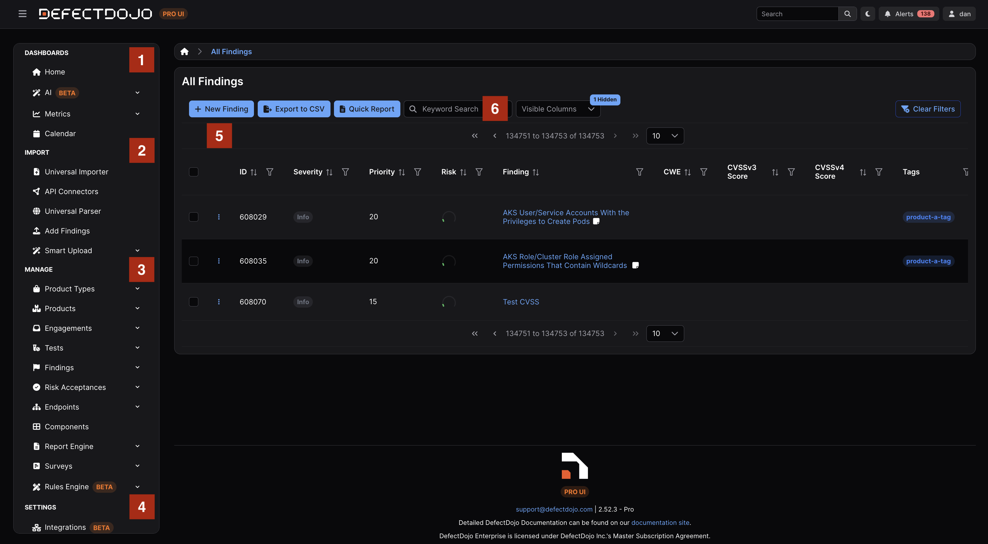
The Sidebar has been reorganized into four parent categories: Dashboards, Import, Manage, and Settings.
The Homepage, AI-powered native API connection capabilities, Pro Metrics, and the Calendar view are all accessible under Dashboards.
Import methods can be found in the Import section: set up Connectors to pull findings in from your scanners (Upstream) or push them out to issue trackers (Downstream), use the Add Findings form to Add Findings, use Smart Upload to handle infrastructure scanning tools, or use our external tools—Universal Importer and DefectDojo CLI—to streamline both the import and reimport processes of Findings and associated objects.
The Manage section allows you to view different objects in the Asset Hierarchy, with views for Organizations, Assets, Engagements, Tests, Findings, Risk Acceptances, Endpoints, and Components. There are additional sections for generating reports (Report Builder), using surveys (Surveys), as well as a Rules Engine.
The Settings section allows you to configure your DefectDojo instance, including your License, Cloud Settings, Users, Feature Configuration and admin-level Enterprise Settings. (Integrations have moved to Import > Connectors > Downstream Connectors.)
The Settings section holds the administrative pages, grouped as System, Users & Permissions, Finding Workflow, Configuration, Notifications, Operations, and License & Support, with an All Settings page that lists and searches all of them. See The Sidebar Menu.
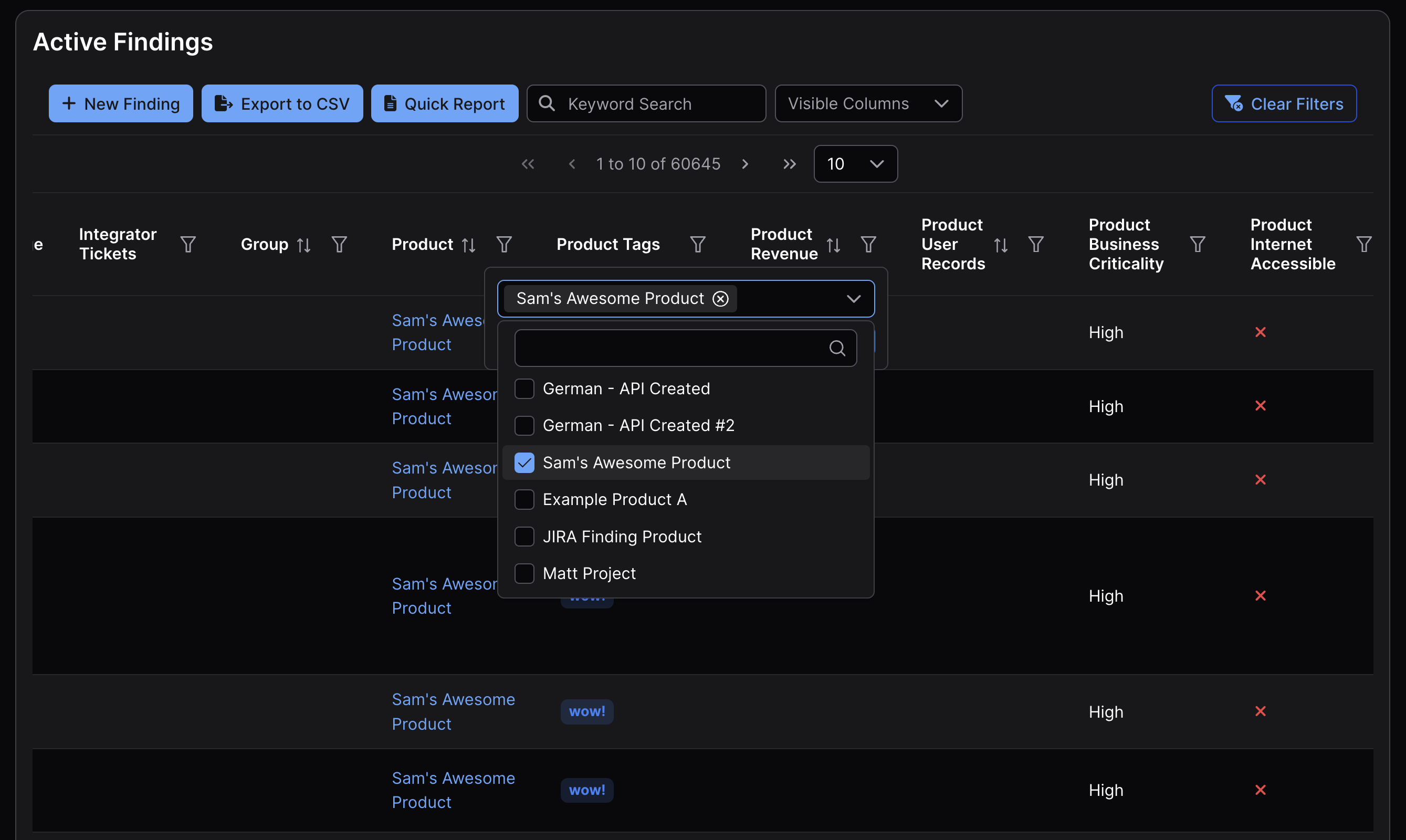
The Pro UI also has a new table format, used in the Asset Hierarchy to help with navigation. Each column can be clicked on to apply a relevant filter, and columns can be reordered to present data however you like.
The table also has a “Toggle Columns” menu which can add or remove columns from the table.
Filtering the Table
In this screenshot we are filtering for all Findings that are in “Sam’s Awesome Asset.” Once we click Apply, the contents of this Finding list will update to reflect the chosen filter.
New Dashboards
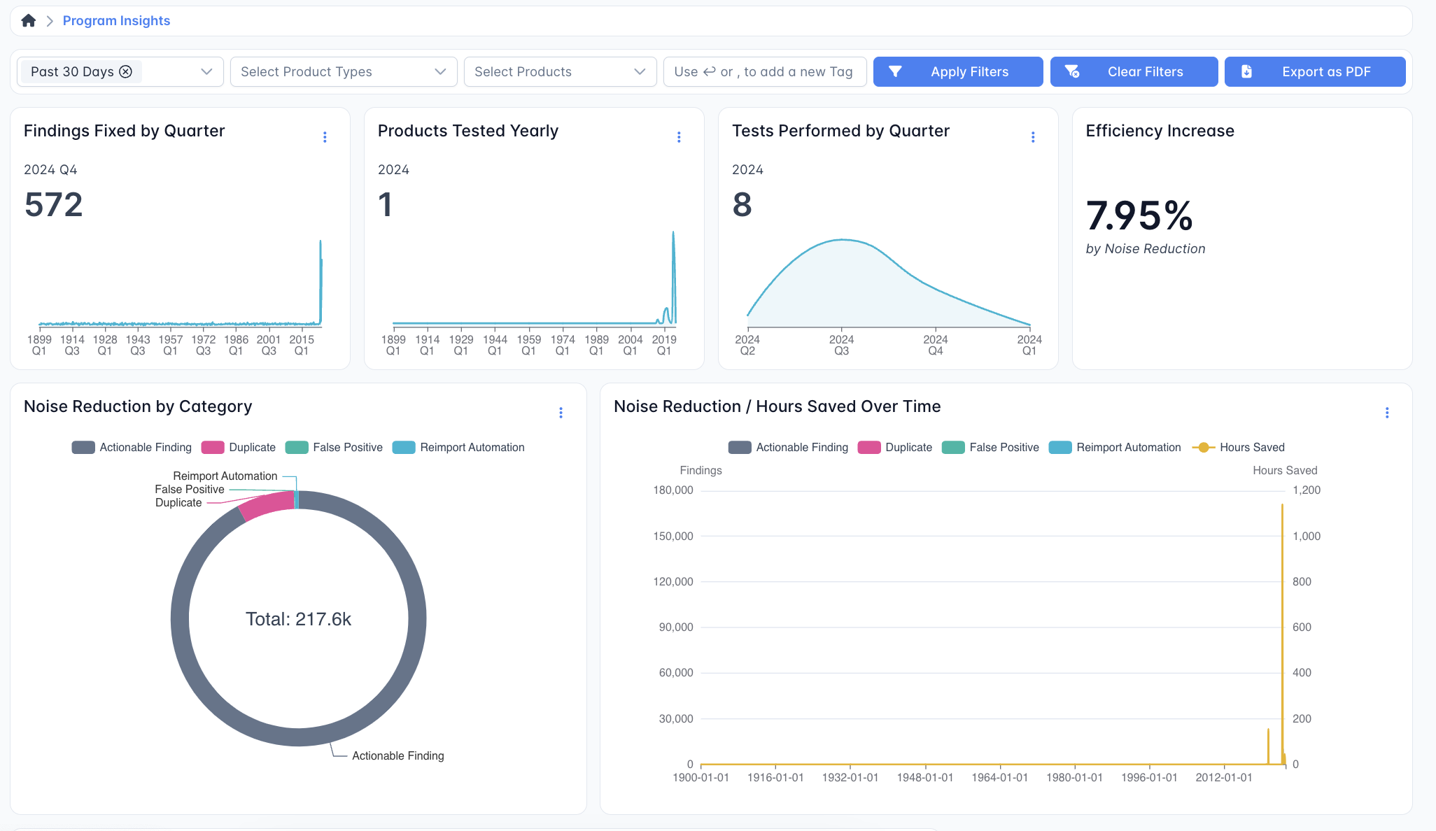
New Metrics visualizations are included in the Pro UI. All of these reports can be filtered and exported as PDFs to share them with a wider audience.
- The Executive Insights dashboard displays the current state of your Assets and Organizations.
- Priority Insights show the most critical findings with the option to filter for various timelines, Organizations, Assets, and Tags.
- The Program Insights dashboard displays the effectiveness of your security team and the cost savings associated with separating duplicates and false positives from actionable Findings.
- Remediation Insights displays your team’s effectiveness at remediating Findings.
- Tool Insights displays the effectiveness of your tool suite (and Upstream Connector pipelines) at detecting and reporting vulnerabilities.